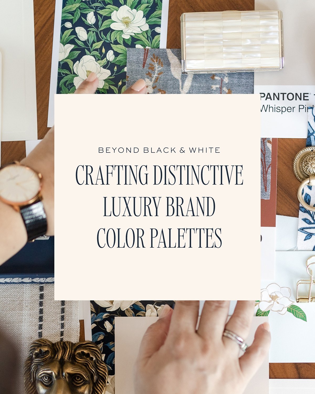
The Monochrome Monopoly
Let’s address the elephant in the room: black and white are to luxury brands what pasta is to Italian cuisine – you really can’t go wrong with it. But here’s the thing about your brand identity: while playing it safe with monochrome might guarantee you a seat at the luxury table, it won’t necessarily help you stand out in a sea of identical Instagram grids.
Breaking Free from the Black-and-White Box
Your brand personality deserves better than being another black-and-white logo in a crowd of black-and-white logos. Yes, these colors speak volumes about glamour and sophistication (and yes, throwing in some gold accents is practically a luxury brand rite of passage). But your brand strategy might benefit from coloring outside those well-worn lines.
Finding Your True Colors
Think of your brand color palette as your visual voice in the luxury space. Maybe you’re more of a ‘quiet luxury’ whisper than a ‘black-tie gala’ statement. Perhaps your brand resonates with the warmth of golden autumn rather than the cool sophistication of monochrome. From Classic Elegance to Coastal Charm, we’re about to explore seven luxury color palettes that prove you can be sophisticated without looking like everyone else’s business card.

Quiet Luxury – it may have been inspired by the hit tv show Succession, but this look has always been evocative of elegance and understated chic. It’s a very nuanced, carefully considered look.

Coastal Charm breaths a breath of fresh air, and is more uplifting and yet serene instead of glamorous. But these colors can be upscale too. Note that we are not using the saturated versions of these coastal colors. It’s fresh, but still sophisticated.

Tailored Timeless if you want to convey a buttoned up Saville Row kind of elegance and tradition.

Classic Elegance – traditional, refined, and sophisticated, this shows an established brand, but not a boring one. A very dark teal anchors this palette and gives it warmth and depth.

Golden Autumn is inspired by two luxury brands that you probably know. It’s bold, rich, vibrant, and yet classic & sophisticated.

Rich Romance is more feminine, sensual, romantic, but not overly so. The colors are not very saturated, which lends a more elegant look.

If country club chic is your vibe, Refined Heritage might be the perfect palette to communicate that. Those who want the feel of a storied brand with a rich heritage, or those with an equestrian-inspired look will be better off with this instead of black and white.
Your perfect luxury color palette isn’t just about what looks good – it’s about what feels authentically you. Think of these seven palettes as starting points for your brand’s visual journey.
Remember: while black and white might be the little black dress of brand identities, your brand deserves a color palette as unique as its story. Choose colors that not only look luxurious but feel true to your brand’s personality, values, and vision. After all, in a world of monochrome luxury, it’s the brands that dare to be different that often leave the most lasting impression.