Defining KPI Trees
The official KPI Tree definition: a simple, visual hierarchy to show how an organisation’s big-picture goals break down into day-to-day results you can measure and track. KPI Trees also allow you to visualise complex relationships, conflicts and interdependencies within an organisation.
The KPI Tree method of designing key performance indicators was invented by Bernie Smith in 2011 and first appeared in his book, KPI Checklists (published 2013). They expand on the concept of driver trees (from P-M Analysis, part of the Toyota Product System) and the Strategy Maps approach developed by Kaplan and Norton.
The KPI Tree approach and notation was specifically created to be a quick and easy way to spot exactly which KPIs your business needs.
5 Powerful Benefits of KPI Trees
KPI Trees are all about breaking down vague aspirational goals into meaningful metrics. Here are five powerful benefits they provide:
- Sum up a complex situation with just a few markers: With the KPI Tree you naturally arrange target KPIs into meaningful groups, in a clear hierarchy. Want to get an overall score? Just decide how important each bit is and do some basic maths.
- Get everyone on the same page: Every client Bernie has worked with has featured a dominant character in the group. This character can bounce a group into a particular set of measures through a mixture of rational argument and strength of will (in other words, the loudest voice wins). Developing a KPI Tree avoids this by getting everyone involved in building the measures together during a series of sessions. Anyone can chip in and question things because it’s all laid out clearly and follows a framework.
- Makes explaining the approach easy: It normally takes two two-hour workshops to get a group up to speed and to successfully create a complex KPI Tree, but you can teach someone to read a KPI Tree in about five minutes. It can also become a powerful way for executives and bosses to explain their approach in terms that a group can really understand. It shows they’ve really thought things through.
- Keep up with changes in strategy: Businesses, markets and executive teams change. It’s absolutely guaranteed that, if you are lucky enough to have a good roadmap, it will have to change – possibly very soon. Using the KPI Tree approach means that you can see what impact changes in the roadmap will have on your measures.
- Understand how measures interact: You can have too much of a good thing. It’s especially true in the world of measures. Measures can often be driven by mutually exclusive goals. By pushing a ‘good’ measure too far you can unexpectedly have a negative impact on your ultimate strategic objective.
All this means you choose meaningful and productive KPIs that improve data-driven decision-making. If you don’t use an approach like this, then your KPIs are normally the measures that the biggest personality in the room wanted.
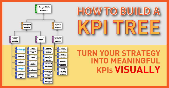
KPI Tree Visualisation
The basic KPI Tree structure design has four levels, and we use different colours to make the KPI Tree visualisation dead easy to follow.
At Made to Measure KPIs, we use green for the Strategic level, orange for Theme level, purple for Tactical level and blue for the various KPIs driving end results (the ones we’ll eventually track).
Here’s a KPI Tree diagram example Bernie developed for training purposes. This KPI Tree structure is fully fleshed-out for the goal most people relate to: “Be Healthy.” It shows you a proper KPI Tree structure design with four distinct levels from strategy to specific measures, making the KPI Tree depiction really clear and easy to understand.