A Website UI/UX Case Study, 6,500+ PIT Count Homelessness

Disclosure: I asked ChatGPT to help me analyze the website strength for its mission.
Introduction & Framework of Analysis
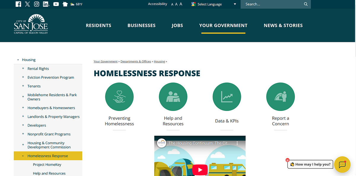
The “Homelessness Response” page on the City of San José’s official site (sanjoseca.gov) is intended to serve several audiences: people currently experiencing homelessness seeking help, advocates or service providers looking for data and policies, concerned residents seeking to understand city efforts, and journalists or researchers. The design of a public-agency site like this must balance accessibility, clarity, trustworthiness, navigability, and comprehensiveness. In this review, I evaluate this page’s strengths and weaknesses across multiple criteria:
- Purpose alignment and target audience fit
- Information architecture and navigation
- Content clarity, readability, and tone
- Visual design, layout, and affordances
- Accessibility and inclusivity
- Trust, credibility, and transparency