
I’ve put together a set of tools in Python that you can use to recreate those clean, elegant visualizations that The Athletic — and other outlets — are so good at making. These are meant to be plug-and-play, easily modifiable to work with different requirements, and quite simple to set up.
Web scraping pipeline:
The first tool is a web scraping pipeline for understat.com — which is, in my opinion, the best free football data provider. You can get event data for shots and passes, along with many cool stats that you can do a lot with. But for now, and for this example, it’s set up to only scrape the data needed for making the shot map seen above.
Download it here.
To set it up, you’ll only need to tell it what match(es) you’re interested in. Head over to understat.com and browse. In this example, I selected Real Madrid’s 1–1 draw away at Mallorca.
The variable matchis what our tool will use to get the data:
url = 'https://understat.com/match/'
id = input('Enter the match id: ')
match = url + id
To set up the process, you’ll need to provide a ‘match ID’, which is a numerical identifier found at the end of the match URL you intend to scrape.

For instance, in this case, the match ID is 26989. This value should be assigned to the id variable as input:

Once you press enter, the match variable will be properly initialized.
The tool will then proceed to fetch the relevant data, which is returned in JSON format. It will parse this data, store it in a dataframe, and export it as an Excel or CSV file, according to your preference.
As previously mentioned, the tool is currently configured to extract only the essential data needed to generate a shot map. However, it’s designed to be highly flexible, allowing you to expand its functionality to gather a broader range of statistics. Here’s how you can do that:
First, note that we’ve declared the following lists to store the metrics we’re currently interested in:
x_cor = []
y_cor = []
xg = []
result = []
player = []
team = []
These lists will hold the data points for each respective metric. The tool iterates through the dataset using a for loop, appending the relevant data to the appropriate list. The loop structure looks like this:
for index in range(len(home_data)):
    for key in home_data[index]:
        if key == 'X':
            x_cor.append(home_data[index][key])
        if key == 'Y':
            y_cor.append(home_data[index][key])
        if key == 'xG':
            xg.append(home_data[index][key])
        if key == 'h_team':
            team.append(home_data[index][key])
        if key == 'result':
            result.append(home_data[index][key])
        if key == 'player':
            player.append(home_data[index][key])
This loop is designed to process data for the home team, and a similar loop is used for the away team. If you wish to get additional stats, the process is straightforward. Simply declare a new list to store the additional metric, and then add a corresponding if statement within the for loop to append that desired data.
For instance, if you wanted to track a new metric like ‘situation’, for example, which tells you if the shot took place in open play or from a set-piece, you would do the following:
- Declare the List:
situation = []
2. Add the if Statement:
if key == 'situation':
    situation.append(home_data[index][key])
To explore what metrics are available, you’ll need to examine the JSON file that has been extracted from Understat. In this instance, the data is stored in a variable named data. To inspect the contents, simply print the data variable, which will allow you to review the structure and identify the available stats.
print(data)
Here’s what it looks like:
{'id': '585513',
   'minute': '4',
   'result': 'SavedShot',
   'X': '0.7969999694824219',
   'Y': '0.3',
   'xG': '0.025415588170289993',
   'player': 'Samú Costa',
   'h_a': 'h',
   'player_id': '10974',
   'situation': 'OpenPlay',
   'season': '2024',
   'shotType': 'LeftFoot',
   'match_id': '26989',
   'h_team': 'Mallorca',
   'a_team': 'Real Madrid',
   'h_goals': '1',
   'a_goals': '1',
   'date': '2024-08-18 19:30:00',
   'player_assisted': 'Pablo Maffeo',
   'lastAction': 'Pass'}
This represents a single entry in our dataset, that basically describes a specific event during the match. Each entry encapsulates all relevant information about that event, including its timing, outcome, location on the pitch, and the players involved. Importantly, this example highlights the key statistics available for extraction.
After completing the setup, simply run the code to retrieve the data, which will be organized into a dataframe. This is what your data should look like after running the program:

From there, you can export it as either an Excel or CSV file that you can manipulate and work with more easily:
df.to_csv('shotmap.csv', index=False)
Plotting the Shot Map:
Now that we’ve successfully extracted the data and structured it within a dataframe, we can bring those numbers to life with a visualization.
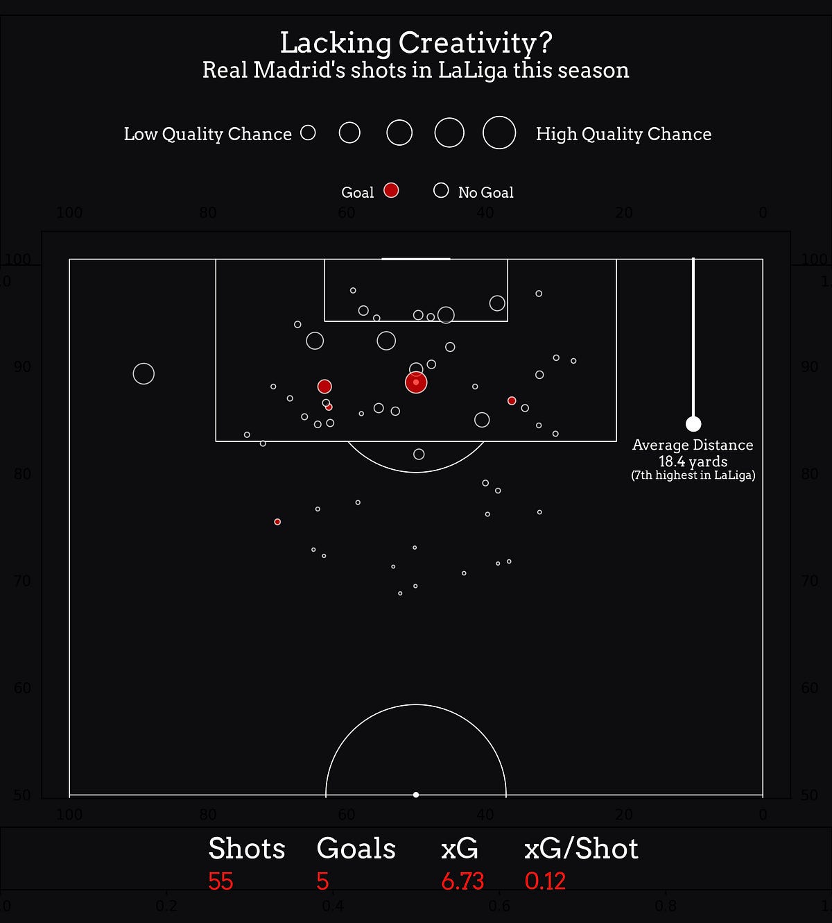
This next tool is a designed for plotting a shot map, inspired by The Athletic’s clean and elegant style that always looks great. The goal is to produce minimalistic yet visually appealing plots that not only look great but also provide insights with clarity and simplicity.
Download it here.
This shot map visualization is split into three main sections: the legend at the top, the pitch visualization in the center, and the key stats at the bottom. Each part is easy to customize based on your needs.
The legend includes a title, a scale for shot quality, and an indicator showing the shot outcome.
You can customize the title by editing the strings in this block:
# title
ax1.text(
    x = .5,
    y = .85,
    s = 'Lacking Creativity?',
    fontsize = 20,
    fontproperties = font_props,
    fontweight = 'bold',
    color = 'white',
    ha = 'center'
)
# subtitle
ax1.text(
    x = .5,
    y = .75,
    s = "Real Madrid's shots in LaLiga this season",
    fontsize = 15,
    fontproperties = font_props,
    fontweight = 'bold',
    color = 'white',
    ha = 'center'
)
The s parameter sets the text content, while color changes the text color. fontweight controls whether the text is bold, italic, or regular, and fontsize adjusts the size of the text (in case you couldn’t figure those out yourself). The values in the code are exactly what you see in the example visualization, so you can use that as a guide.
To change the font itself, you’ll need to update the font_props variable. Just change this section to point to the font file you want to use on your computer:
font_path = 'Arvo-Regular.ttf'
font_props = font_manager.FontProperties(fname=font_path)
Replace 'Arvo-Regular.ttf' with the path to your chosen font file.
All other text elements can be customized in the same way.
The shot quality scale may or may not be needed, depending on what type of Shot Map you’re going for. But in case you don’t want it, simply comment out the block:
'''
# descriptions
ax1.text(
    x = .25,
    y = .5,
    s = "Low Quality Chance",
    fontsize = 12,
    fontproperties = font_props,
    fontweight = 'bold',
    color = 'white',
    ha = 'center'
)
ax1.text(
    x = .75,
    y = .5,
    s = "High Quality Chance",
    fontsize = 12,
    fontproperties = font_props,
    fontweight = 'bold',
    color = 'white',
    ha = 'center'
)
# circles (low - high quality chance)
ax1.scatter(
    x = .37,
    y = .53,
    s = 100,
    color = background_color,
    edgecolor = 'white',
    linewidth = .8
)
ax1.scatter(
    x = .42,
    y = .53,
    s = 200,
    color = background_color,
    edgecolor = 'white',
    linewidth = .8
)
ax1.scatter(
    x = .48,
    y = .53,
    s = 300,
    color = background_color,
    edgecolor = 'white',
    linewidth = .8
)
ax1.scatter(
    x = .54,
    y = .53,
    s = 400,
    color = background_color,
    edgecolor = 'white',
    linewidth = .8
)
ax1.scatter(
    x = .6,
    y = .53,
    s = 500,
    color = background_color,
    edgecolor = 'white',
    linewidth = .8
)
'''
Add three single or double quotation marks one line above and below the block to comment it out.
Then, as far as the visualization itself goes, there are a few things to note. The core functionality of this tool is to iterate through each shot in the DataFrame by using a for loop, and plot it on the pitch.
# Plot shots
for x in df.to_dict(orient = 'records'):
    pitch.scatter(
        x['X'],
        x['Y'],
        s=300 * x['xG'],
        color='red' if x['result'] == 'Goal' else background_color,
        ax=ax2,
        alpha=.7,
        linewidth=.8,
        edgecolor='white'
    )
It uses the scatter function to place a marker at the shot’s location (X, Y), with the size of the marker scaled by the shot’s expected goals (xG). You can adjust this by modifying the coefficient tied to the s variable, — in this case, 300.
The color of the marker is set to red if the shot resulted in a goal, otherwise, it blends with the background. The markers are slightly transparent (alpha=.7), have a thin white border (edgecolor='white'), and are plotted on the specified axis (ax=ax2). This is meant to visualize both the quality and outcome of each shot.
Again, if there’s any element to this you think is unnecessary, commenting out the block is what I’d recommend.
Finally, you can save your plot as an image with the following line:
# Export
fig.savefig("plot.png", dpi=300)
In this example, the plot is stored in the fig variable. If you’ve renamed this variable for any reason, make sure to update the snippet accordingly to reflect that change. We use thedpi=300 parameter for a crisp and professional look.
And that’s it! It’s a simple tool, but I hope it can be useful. Please let me know if you have any questions, or if there’s anything specefic I didn’t go over that you’d like to know.
Thank you for reading.
Learn more Build professional-looking event maps using Python! (w/ download links & set-up guides)