
Overall Summary
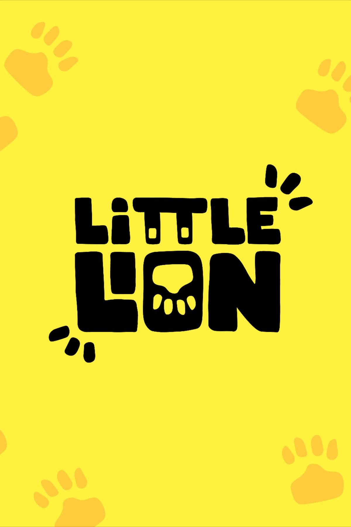
The ‘LITTLE LION’ logo presents a clever integration of a lion’s face into the typography, which is a strong conceptual start. However, inconsistencies in dot shapes for the ‘i’ and ‘TT’ in ‘LITTLE,’ along with superfluous tiny details and generic paw prints, create unnecessary clutter and detract from the overall tidiness. The lion’s representation is somewhat ambiguous, lacking the clear depiction of dominance often sought in lion logos, which could impact its memorability and unique identity. Further refinement in execution and consistency would elevate this design significantly.
Positive Points
✓ The integration of the lion’s face into the ‘O’ of ‘LION’ is a clever idea for combining an object with a letter, showing good conceptual design.
✓ The bold, black typography on a bright yellow background provides excellent contrast, ensuring good visibility as per principles of color contrast.
✓ The overall playful style of the lettering is consistent with a ‘Little Lion’ concept, making it appealing and legible.
✓ The logo has a unique core element in the typography, aiming to stand out from generic wordmarks.
Areas for Improvement
Learn more about Logo Review #2. The ‘LITTLE LION’ logo presents a…