Overall Summary
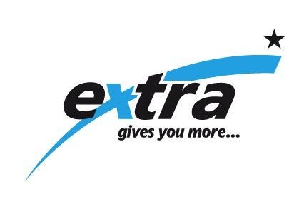
This logo attempts to convey ‘extra’ value through its dynamic blue swoosh and star, with a notable integration into the letter ‘x’. However, the composition appears unstable due to its upward trajectory, a critical issue for communicating reliability. Its generic elements diminish its uniqueness, making it likely to blend in with countless similar designs. Furthermore, the stylistic inconsistency between the swoosh’s curves and the star’s sharp points, along with minor kerning problems in the tagline, indicate a need for greater harmony and attention to detail. These issues prevent it from achieving a higher rating.
Positive Points
✓ The blue swoosh is effectively integrated with the letter ‘x’ in ‘extra’, demonstrating a thoughtful combination of elements.
✓ The typography for ‘extra’ is a suitable modern sans-serif, avoiding problematic fonts.
✓ The rising blue swoosh with the star aims to convey a dynamic message of progress or ‘extra’ value, which aligns with the brand name.
Areas for Improvement
✗ The overall composition appears unstable due to the strong upward diagonal of the swoosh and star, contradicting the principle that logos should suggest stability and reliability.
Learn more about Logo Review #1. Overall Summary
