
Here is another experiment of mine with Nano Banana Pro. This time I instructed model with very minute details like Text, Layout, Colorscheme etc. and it gave me near perfect results. This poster would have cost me around $50-$100 but I was able to create it in a few cents.
Prompt :
Magazine Editorial Spread
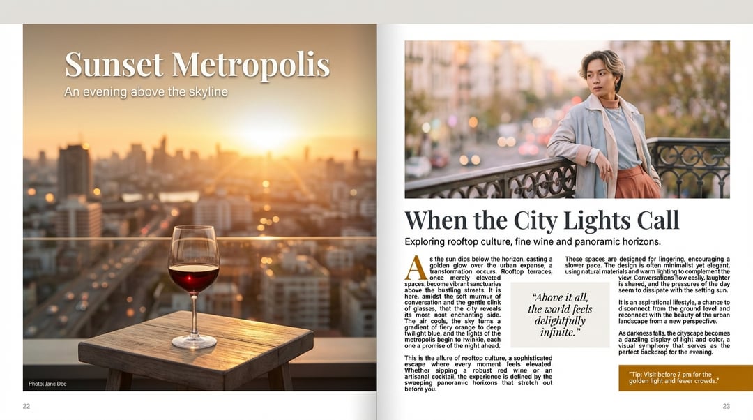
Generate a two-page spread, open flat (left and right pages visible) of a magazine feature.
Picture / image details: On the left page, a full-page photo shows a stylised scene: a golden hour cityscape viewed from a rooftop terrace, warm sunlight, slight lens flare, a glass of red wine on a low table in the foreground, subtle bokeh in the background. The photo should bleed to the edges of the left page, with no visible margin on the top and outer edge, and a narrow margin on the inner gutter. On the right page, a second image occupies the top half of the page: a close-up portrait of a fashionable individual leaning against a balustrade, soft pastel tones, shallow depth of field, gaze slightly off-camera.
Text / layout details:
On the left page, overlay in the top-left corner a headline in large serif font: “Sunset Metropolis” (approx 72 pt), in off-white with subtle drop-shadow. Below that, a sub-headline in smaller sans-serif font (approx 28 pt): “An evening above the skyline”. At the bottom of the left page, a caption line in fine print (approx 11 pt) reading: “Photo: Jane Doe”. The left page has no body text besides the caption.
On the right page, the body text begins under the top image: a headline spanning two lines in serif font (approx 48 pt): “When the City Lights Call”. Beneath it, a deck (intro text) in sans-serif (approx 18 pt): “Exploring rooftop culture, fine wine and panoramic horizons.” Then the main article body in two columns of justified text in serif (approx 12 pt, leading 16 pt). The first paragraph begins with a large drop-cap initial letter (approx 40 pt) in a contrasting color (#B36B00). The text wraps around a pull-quote in the right-hand column: a rectangular box with background color #F4F1EE and quote text in italic serif (approx 20 pt): “Above it all, the world feels delightfully infinite.” At the bottom right corner of the right page, a small call-out box (approx width 40% of page) with background #B36B00 and white text (approx 14 pt) reading: “Tip: Visit before 7 pm for the golden light and fewer crowds.”
Design style & color palette: Minimalistic but elegant; the palette uses warm gold (#D9A441), deep charcoal (#333333), off-white (#F4F1EE), and accent amber (#B36B00). Plenty of white space around margins and between columns. Use consistent alignment of text frames and maintain ~12 mm margin from page edge.
Mood & tone: Sophisticated lifestyle-travel feature, aspirational but relaxed. The layout should guide the eye naturally from the left page’s big image and headline into the right page’s headline and body copy.
Output format: High-resolution (300 dpi) print ready spread, CMYK color mode, showing both pages side-by-side. Provide the editable layout file (e.g., InDesign / Adobe Illustrator) and also a flattened PDF preview.
Additional instructions: Ensure bleed area of 5 mm. On the right page, ensure the gutter between columns is wide enough (~10 mm) for readability. The photo edges on the right page should not be cropped awkwardly – align the image top with the top margin grid. Maintain consistent baseline grid across both columns of body text. Include page numbers in the footer (left page: 22, right page: 23) in small sans-serif (#666666) aligned outer bottom.
Source: https://vakpixel.com/nano-banana-pro-gallery/magazine-editorial-spread