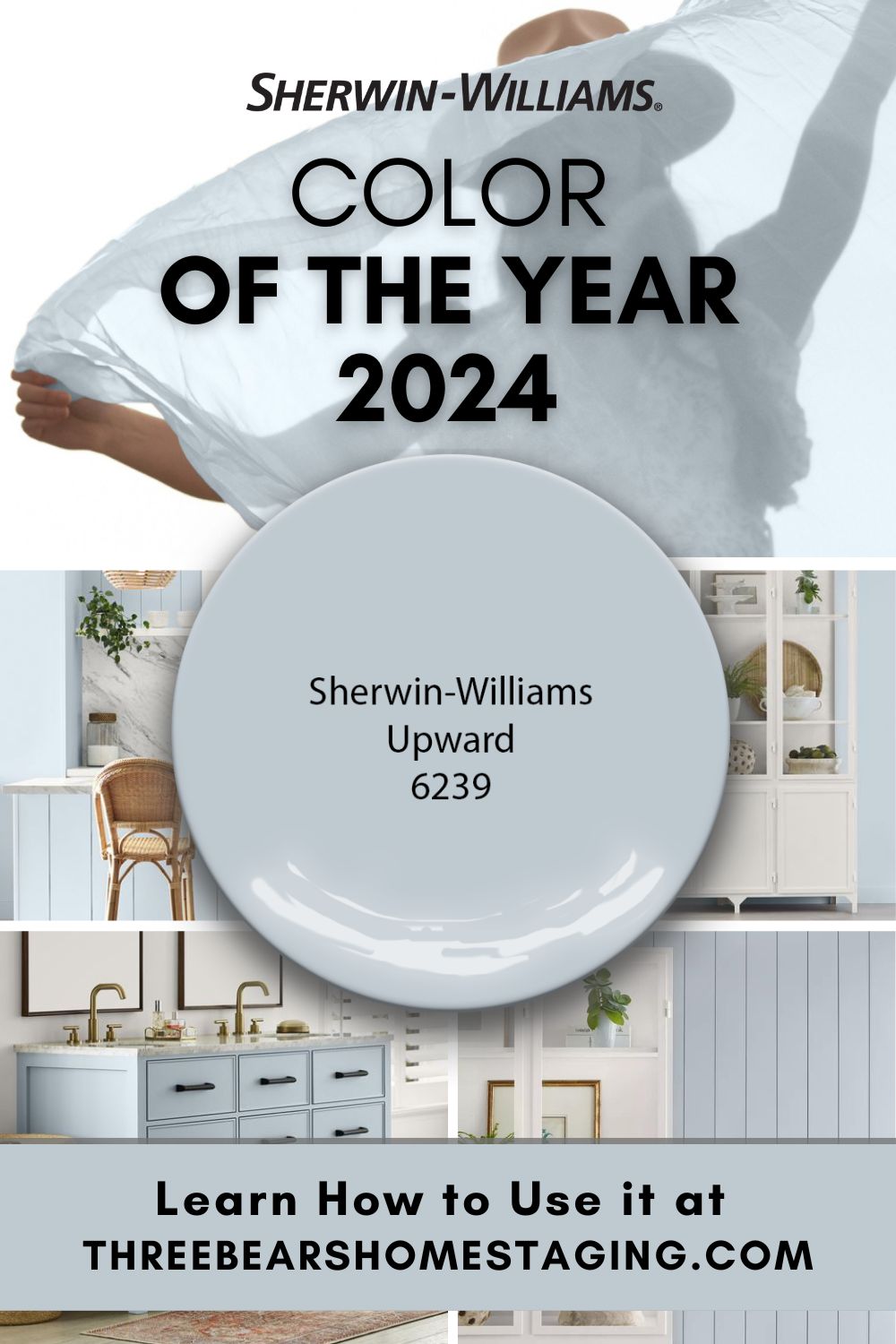
As we move toward 2024, it’s worth noting a few current trends in the world of color. Color choices are becoming more daring. Neutral tones are getting lighter. There’s also a growing desire among consumers for healing, peace, and a return to normalcy. It’s the perfect time for a stunning celestial shade of blue to take center stage. This week, Sherwin-Williams revealed Upward (SW 6239) as its 2024 Color of the Year, a hue that’s truly a leisurely breath of fresh air. Let’s take a look at why it’s trending this year, where it falls on the color wheel, and how to make it work in your home.
Why Is Sherwin-Williams Upward a Trendy Color for 2024?
This pale blue, tinged with hints of gray, promotes a sense of balance and tranquility. While greens and earthy tones have held sway over the past few years, industry experts are predicting blues and ethereal shades are set to become the new favorites. Sherwin-Williams seems determined to showcase a blue hue from the outset. In its biennial trend report, Colormix Forecast 2024, Anthology: Volume One, Sherwin-Williams says that Upward offers a soft push forward, offering a sense of weightless serenity and ethereal tranquility. “With this color, we invite our consumers to take a pause and infuse a new sense of ease and possibility into their spaces—one that doesn’t overwhelm, but rather establishes meditation and tranquility,” says Sue Wadden, director of color marketing at Sherwin-Williams.
The announcement of a gentle, calming color like Upward may signify an emerging evolution in the connection between color and well-being. The tranquil neutral tone of 2022’s Evergreen Fog and the vibrant earthiness of 2023’s Redend Point provided a sense of steadiness during uncertain times. A serene blue like Upward, on the other hand, inspires individuals to create moments for themselves. This comes at a juncture when the return to “normal” life can sometimes feel more hectic than ever, driving a need for personal space and time.
The resurgence of Scandinavian slow living principles and coastal chic design also seems to be a significant influence behind Upward’s selection. Upwards is poised to provide an alternative to the long-standing farmhouse aesthetic that’s been dominant for so long. It’s the perfect color to infuse that relaxed, beachy atmosphere into your home.

What Are the Undertones for Sherwin Williams Upward? What Color is Upward?
Color perception can be so subjective. Lighting, context, and a person’s own color acuity all influence how a color looks. That’s why we always like to take a look at objective, measurable data (like hue angle, chroma, and LRV) when reviewing a paint color. This information can help us better predict how a color will look in real life under various conditions.

Hue Family
Like all colors, Upward SW6239 lives in a specific location on the color wheel based on its dominant hue angle. Upward has a hue angle of 249.799° which means it’s in the Blue family. You may see it lean a bit violet in certain qualities of light. This can make it a little tricky to work with since many home interiors tend to favor the greener side of blue (not the violet). See what works best in your own space.
Chroma
Chroma, another bit of spectral data, is a measure of how colorful, saturated, or vivid a hue is. Upward has a fairly low chroma value (4.989). This means the blue has been toned down with a healthy dose of gray.
LRV
Light Reflectance Value (LRV) is a measure of how much light a paint reflects back into a room, with 100% being highly reflective and zero being not reflective at all. Upward has an LRV of 57, which makes it just right for many residential interiors. In a room with northern or eastern afternoon light, Upward looks quite cool and crisp. Upward can add a little visual harmony and balance to sunny rooms filled with warm southern or western afternoon light. Always, always make sure you’re using the right color light bulbs (3000K to 3500K) to evaluate your interior paint colors.
Tired of guessing how paint colors will really look? Or stressing over hidden undertones?
With our online course, Color By The Numbers™, you’ll learn to read spectral data and choose colors with total confidence. No more guesswork—just beautiful results.
Ready to take a peek?
How to Use the Sherwin-Williams 2024 Color of the Year Upwards in Your Home
The rarefied blue is part of Palette No. 1 in Sherwin-Williams Colormix® Forecast 2024, Anthology: Volume One. Wondering what colors go with Upward? Upward looks beautiful paired with blues and greens, deeps and darks, and delicate tints. Combining it with neutrals can amplify Upward’s overall calming influence. Colors like Snowbound SW 7004, Drift of Mist SW 9166, Gale Force SW 7605, Tricorn Black SW 6528, Honeydew SW 6428, Palm Leaf SW 7735, and Antiquarian Brown SW 0045 are also beautiful options.

The subtle presence of gray within Upward’s gentle blue makes it great for spaces where you want a touch of freshness without overwhelming saturation. Think of places like a laundry room or bathroom where this balance is ideal. If you’re feeling more adventurous, consider using it on an accent wall or even on the ceiling. Upward can even serve as a focal point in your space. Use it to invigorate kitchen cabinetry or to add a touch of radiance to a bathroom vanity. It can also serve as a focal point for your front door, or breathe new life into a vintage piece of furniture.
Upward also pairs beautifully with warm brown pieces, wood-toned furniture, and marble in the home. For a coastal vibe, consider combining Upward with a white shade, like Alabaster or Snowbound, along with light to medium-toned stained wood elements.
To ignite your imagination and inspire you to create serene spaces using Upward, we’ve curated a selection of complementary art, accessories, and home décor items from Amazon.

Discover the Perfect Palette: Your Ultimate Color Sampling Toolkit
Feeling inspired by Sherwin-Williams’ Color of the Year? Now’s the perfect time to explore even more possibilities for your home. Check out our new series of ready-made color palettes and swatches. These ready-made kits designed to make it easy to sample and compare paint colors in your space. Whether you’re painting a single room or refreshing your entire home, our palettes can help you find the perfect shades to bring your vision to life. Start experimenting with color combinations today and see how effortlessly you can transform your home’s look!
Need a More Paint Color Guidance?
Need help finding the right paint color? Order a Virtual Color Consultation Report from the color professionals at Three Bears Home Staging! You’ll get a custom, curated palette and guidance for your next painting project. Take a look at our packages below:
Order Your Virtual Color Consultation Report Today!
Whether you’re looking for a complete refresh of your space, experimenting with a new style, or just need a little professional guidance to help narrow down your paint color choices, our online color consultations can help!

Vannessa Rhoades
Vannessa Rhoades is the author of Just Right! Easy DIY Home Staging and the founder of the award-winning firm, Three Bears Home Staging®. She specializes in providing positive, empowering virtual consultations that help homeowners and real estate agents all across the country sell more quickly and for more money.