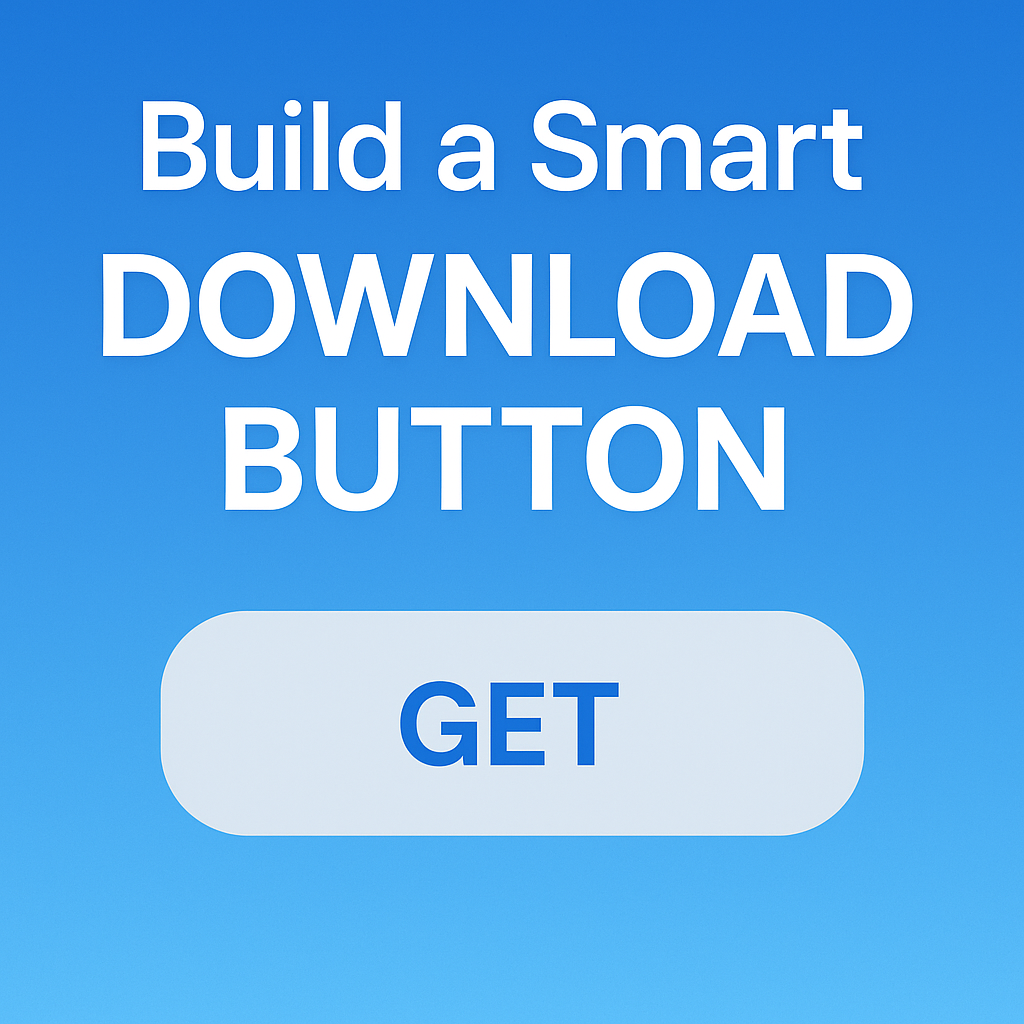
Ever noticed how download buttons in real apps change states — from “GET”, to a loading spinner, to progress, and finally “OPEN”?
In this article, we’ll build a reusable Flutter widget that does just that — with clean animations and clear UX.
4 States, 1 Button
Let’s start by defining the download states we need:
enum DownloadStatus {
  notDownloaded,
  fetchingDownload,
  downloading,
  downloaded,
}
What We’re Building
A download button that visually responds to what’s happening:
GETwhen nothing’s downloaded yet- Spinner when fetching metadata
- Circular progress bar while downloading
OPENonce the download is complete
And yes, everything animated smoothly.
The DownloadButton Widget
This widget doesn’t manage its own state — all data comes from its parent, which makes it easier to test and reuse.
class DownloadButton extends StatelessWidget {
  const DownloadButton({
    super.key,
    required this.status,
    this.downloadProgress = 0,
    required this.onDownload,
    required this.onCancel,
    required this.onOpen,
    this.transitionDuration = const Duration(milliseconds: 500),
  });
  final DownloadStatus status;
  final double downloadProgress;
  final VoidCallback onDownload;
  final VoidCallback onCancel;
  final VoidCallback onOpen;
  final Duration transitionDuration;  bool get _isDownloading => status == DownloadStatus.downloading;
  bool get _isFetching => status == DownloadStatus.fetchingDownload;
  bool get _isDownloaded => status == DownloadStatus.downloaded;  void _onPressed() {
    switch (status) {
      case DownloadStatus.notDownloaded:
        onDownload();
      case DownloadStatus.fetchingDownload:
        break;
      case DownloadStatus.downloading:
        onCancel();
      case DownloadStatus.downloaded:
        onOpen();
    }
  }  @override
  Widget build(BuildContext context) {
    return GestureDetector(
      onTap: _onPressed,
      child: Stack(
        children: [
          ButtonShapeWidget(
            isDownloading: _isDownloading,
            isDownloaded: _isDownloaded,
            isFetching: _isFetching,
            transitionDuration: transitionDuration,
          ),
          Positioned.fill(
            child: AnimatedOpacity(
              duration: transitionDuration,
              opacity: _isFetching || _isDownloading ? 1.0 : 0.0,
              child: Stack(
                alignment: Alignment.center,
                children: [
                  ProgressIndicatorWidget(
                    downloadProgress: downloadProgress,
                    isDownloading: _isDownloading,
                    isFetching: _isFetching,
                  ),
                  if (_isDownloading)
                    const Icon(Icons.stop, size: 14, color: CupertinoColors.activeBlue),
                ],
              ),
            ),
          ),
        ],
      ),
    );
  }
}
Button Shape Changes with State
The button smoothly morphs between shapes: a stadium shape for static states (GET, OPEN) and a circle for loading/progress.
class ButtonShapeWidget extends StatelessWidget {
  const ButtonShapeWidget({
    super.key,
    required this.isDownloading,
    required this.isDownloaded,
    required this.isFetching,
    required this.transitionDuration,
  });
  final bool isDownloading;
  final bool isDownloaded;
  final bool isFetching;
  final Duration transitionDuration;  @override
  Widget build(BuildContext context) {
    final shape = (isDownloading || isFetching)
        ? const ShapeDecoration(shape: CircleBorder(), color: Colors.transparent)
        : const ShapeDecoration(shape: StadiumBorder(), color: CupertinoColors.lightBackgroundGray);    return AnimatedContainer(
      duration: transitionDuration,
      decoration: shape,
      curve: Curves.ease,
      width: double.infinity,
      child: Padding(
        padding: const EdgeInsets.symmetric(vertical: 6),
        child: AnimatedOpacity(
          duration: transitionDuration,
          opacity: (isDownloading || isFetching) ? 0.0 : 1.0,
          child: Text(
            isDownloaded ? 'OPEN' : 'GET',
            textAlign: TextAlign.center,
            style: Theme.of(context).textTheme.labelLarge?.copyWith(
              fontWeight: FontWeight.bold,
              color: CupertinoColors.activeBlue,
            ),
          ),
        ),
      ),
    );
  }
}
Spinner & Progress Indicator
We use different visuals for fetching and downloading. Fetching shows a spinner. Downloading shows circular progress with a stop icon.
class ProgressIndicatorWidget extends StatelessWidget {
  const ProgressIndicatorWidget({
    super.key,
    required this.downloadProgress,
    required this.isDownloading,
    required this.isFetching,
  });
  final double downloadProgress;
  final bool isDownloading;
  final bool isFetching;  @override
  Widget build(BuildContext context) {
    if (isFetching) {
      return const CircularProgressIndicator(strokeWidth: 2);
    }    if (isDownloading) {
      return SizedBox(
        width: 28,
        height: 28,
        child: CircularProgressIndicator(
          value: downloadProgress,
          strokeWidth: 2,
          backgroundColor: CupertinoColors.systemGrey4,
          valueColor: AlwaysStoppedAnimation(CupertinoColors.activeBlue),
        ),
      );
    }    return const SizedBox.shrink();
  }
}
Full Flow at a Glance
StatusWhat user seesWhat tap doesnotDownloadedGET buttonStarts downloadfetchingDownloadSpinner (fading in/out)Does nothingdownloadingCircular progress + stop iconCancels downloaddownloadedOPEN buttonOpens the downloaded item
Why This Matters
Buttons like this are everywhere — app stores, podcast players, file downloaders.
Having one that’s:
- smooth,
- reactive,
- and visually clear
…makes your app feel polished and modern. ✨
What Do You Think?
Try it out in your next app!
Got ideas for improvements or customizations? Drop a comment — would love to see your take on it.
#Flutter #DownloadButton #UX #FlutterTips #UIAnimation #StateDrivenUI
Learn more Build a Smart Download Button in Flutter: GET → OPEN with Smooth Animations
