Different approaches and techniques to data mapping and data visualisation
One of the hardest parts of creative mapping is extracting useful information from the raw data you have collected in order to present it in a way that tells a story.
Study the data, and look at what is significant about the data you have collected. What is important? Is there pattern? What is the main question you are trying to answer? By questioning and exploring your research you should be able to establish what is relevant, and what needs to be collated and presented. It is then important to establish the type of visualisation will tell the story, and make it easy to interpret.
Let’s not forget that the key point is making the information digestible, easy to understand and allows the designer to develop strategies and solutions to the design problems. Make sure that the data you are presenting is clear and don’t get too carried away with the visual craziness that we can sometime see in presentations! If your data is displayed badly, the meaning of that data and the story will get lost.
Rather than talk about all the different ideas, it is better to show them. In the examples below we look at a range of different techniques that are used to visualise data. Firstly, these two infographics demonstrate visual representation of data…

Image 01

Image 03
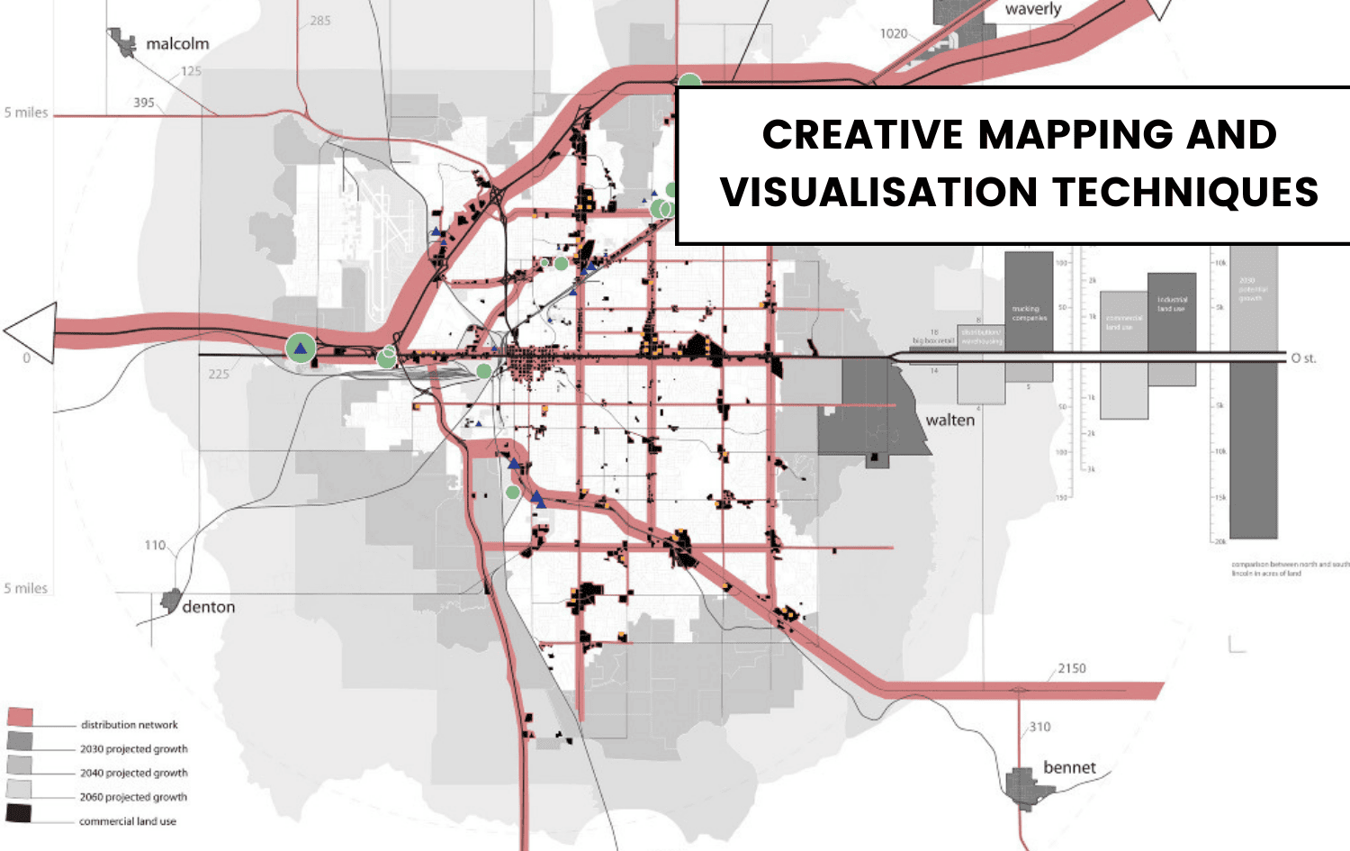
Finally, I share with you a selection of mapping images and data visualisation to hopefully give you some inspiration for your next project. I don’t know what it is, but there is something about these images and diagrams that make them really quite beautiful in their own way. I am not showing these images to suggest this is the only way to present information, but hopefully to inspire you to step back before putting together your next set of research information.

Image 04

Image 05

Image 06

Image 07

Image 08

Image 09

Image 10

Image 11

Image 012

Image 013

Image 014

Image 015

Image 016

Image 017
We have a complete Pinterest board dedicated to mapping techniques and data visualisation, check it out below. And be sure to follow so you don’t miss out on the new mapping technique trends!