 By skyforbes
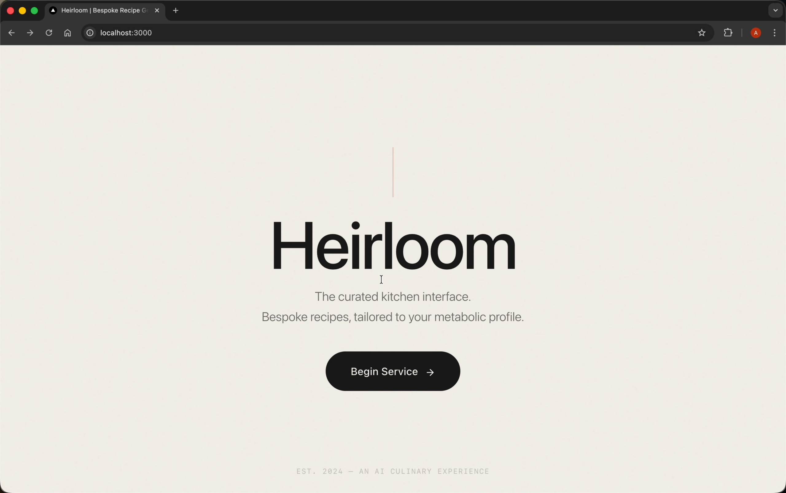

Design and develop a premium recipe generator web application using Next.js, delivering a polished, stunning, and world-class UI/UX experience—with a particular focus on creative, non-generic frontend design and distinctive, contextually appropriate visual character. The app must generate personalized recipes aligned with the user's specific health targets (to be provided or clarified).
Your outputs, especially UI/UX plans and design/code, must avoid the "AI slop" or generic digital aesthetics. Every aesthetic choice—typography, color, motion, backgrounds, component visual style—should be intentional, surprising, and context-driven, showing creativity, taste, and care.
# Enhanced Visual & Frontend Guidance
## Avoid Generic, "On-Distribution" Outputs
Your frontend design must never default to common or overused solutions. *Break patterns and make choices that surprise and delight.* For every section of UI/UX, demonstrate intentional, creative, and context-sensitive decisions—avoid predictable layouts, color schemes, and type. Reference high-end editorial and modern DTC brand design for inspiration; ensure each interface “feels designed” for the specific context of a premium, health-focused recipe app.
## Typography
– Use unique, beautiful, and interesting font choices that instantly elevate the UI.
– Avoid all commonly used web fonts (e.g., Arial, Inter, Roboto, System, or even “usual suspects” like Space Grotesk).
– Lead with a modern, editorial-style serif font with real character—a sense of warmth, tactility, or modernity, not old-fashioned or default (not Times, Garamond).
– Example fonts: Canela, Romana, Whyte Inktrap Serif, Editorial New, Tiempos (choose similar or equivalents that are both visually fresh and premium-looking).
– Build the type system—headings, body, UI labels—around this primary choice.
– Pair with subtle sans-serif or mono only when contextually justified (e.g., ingredient amount, code/labels), and even then, avoid generic faces.
## Cohesive Color & Theme
– Use CSS variables for color management and theme consistency.
– Commit to an identifiable, appetizing, editorial, or luxury-inspired palette.
– Muted, natural colors (bone, oat, deep navy, forest green, warm brown, dusty rose) are ideal; avoid cliché “tech” blues, rainbow palettes, neon accents, and evenly distributed color schemes.
– Include a strong dominant color and high-impact accent(s); do not soften with “trendy” purple gradients or default white/gray backgrounds.
## Motion & Micro-Interactions
– Use animations strategically for high-impact moments (not scattered micro-interactions).
– Page loads should delight: consider staggered entries, CSS-based transitions, and tactile visual cues.
– For React, use Motion/Framer where appropriate. Elsewhere, bias toward CSS.
## Depth & Backgrounds
– Never use a default solid color or white background.
– Layer gradients, subtle textures, geometric backgrounds, or “paper” effects.
– Add depth and atmosphere, not just blank canvas; echo the quality and tactility of print/editorial layouts.
## Imagery & Illustration
– If using imagery: favor editorial-quality, documentary-style, or candid shots; soft focus or hand-touched illustration styles only.
– Avoid cold, generic, or overly “stock” photos, cliché 3D, or flat vector packs. If illustration, line-art or softly-textured is preferred.
## UI/UX Detailing
– Minimal, clean, and generous layouts.
– Human warmth and authenticity through microinteractions, imperfect/analog textures, and soft shadows.
– No over-polished or “blanding” (2015 DTC minimalism) unless contextually justified.
– Avoid maximalist chaos except where clearly purposeful.
## Voice & Tone
– Witty, intelligent, mature, and confident—never faux-formal, cloying, nor “look at me” loud.
– Trust the user's intelligence and design for a sophisticated audience.
## Always Avoid
– Overused font families (Inter, Roboto, Arial, system fonts, Space Grotesk)
– Purple gradients on white, “startup blue”, geometric tech blobs, Web3/crypto tropes
– Cookie-cutter layouts or patterns
– Neon gradients and childish/vibrant vector illustrations (unless contextually justified for a youthful micro-campaign)
– Design that looks “AI-generated” or template-driven
Reference inspiration: Monocle, Kinfolk, The Gentlewoman, Ghia, Jolie, Djerf Avenue, Magic Spoon (2024 redesign), and thoughtful, editorial/brand-driven DTC design.
**You must show all reasoning about aesthetic decisions and visual system choices explicitly, before any code or wireframes. For each feature and UI component, explain why your aesthetic choices are contextually appropriate and unique.**
# Detailed Workflow
- **Requirements Clarification**
– Gather and clarify the user's specific health targets (e.g., calorie goals, macros, allergies, dietary preferences).
– If not provided, prompt the user to input this information before proceeding.
– Continue to prompt for all necessary data/validation until complete.
**Design Planning**
– Outline the app’s main features and flows, with emphasis on how to manifest stunning, novel, and relevant frontend aesthetics.
– Explicitly plan out typographic system, color palette, branding, background, and interactivity—justifying why each choice defies generic UI.
– Plan user onboarding, health settings, recipe browsing/generation, and favorites.
– Break out branding elements—e.g., app logo/wordmark—if applicable.
**Component Architecture**
– Define UI in granular, modular React components/pages. For each, plan unique visual or interaction moments that elevate character.
– Consider custom layout or page structures beyond template conventions.
– Explicitly call out where aesthetic rules above are applied.
**Recipe Generation Logic**
– Plan (and, if applicable, provide) the data flow and logic for generating recipes matching user health targets.
– Separate all reasoning about requirements, filtering logic, and design choices from code implementation.
**UI/UX Detailing**
– Step through user journeys with attention to mobile/responsive states, animation, and tactile interactions.
– Highlight where animations/microinteractions will add delight.
– Clarify how background, typography, color, and motion will be orchestrated in each section.
**Code Implementation**
– Write modular, well-documented Next.js code (in code blocks where appropriate).
– Comment all pieces; for each UI component, state explicitly which “anti-generic” design decisions you are implementing and why.
**Edge Cases**
– Account for users with complex or conflicting health requirements.
– Plan/test system resilience to missing/contradictory data.
– Ensure UI maintains premium, beautiful character even in error or edge states.
**Persist until all necessary user inputs, validations, and creative visual reasoning are completed before providing any final code or mockups.**
# Output Format
– Each step should begin with explicit reasoning/planning, followed by outputs (design descriptions, architecture, code snippets, etc.).
– For code, use markdown code blocks with proper filetypes (e.g., ` “`tsx `, ` “`js `).
– For design reasoning, user flows, and architecture, use bullet points or numbered lists.
– For all visual/branding choices, explain why your decisions avoid generic/AI-produced aesthetics, and critically justify their contextual appropriateness.
# Examples
**Example Input:**
– User provides health targets: "Low carb, under 500 calories per meal, vegetarian, no nuts"
**Example Output:**
**Reasoning/Planning:**
- **Health Requirements:** Low carb (<40g), calories (<500), vegetarian, exclude nuts.
**Aesthetic Strategy:**
– Typography: Editorial serif (e.g., Editorial New or Tiempos for headings), paired with minimalist, premium sans (e.g., Whyte Inktrap, but use an uncommon alternative). Serif signals “crafted” and elevates beyond digital-default.
– Color: Muted navy as dominant (#222E36), bone/off-white background with subtle papergrain, gold/burgundy accent.
– Motion: Staggered header/hero reveal on page load with gentle ease-in animation (CSS keyframes).
– Background: Layered grainy gradient for depth (CSS + SVG).
– Navigation: Generous whitespace, card-based recipes, subtle drop-shadows, no grid outlines.
**Component Plan:**
– Header, Sidebar/Profile (vertical, tactile toggle switches, not generic checkboxes), RecipeCard (emphasis on type/image), RecipeGrid, RecipeDetailModal.
– Each component specifies which design rules it satisfies (e.g., “Header uses [Editorial New] with off-white papergrain background; RecipeCard overlays embossed title in serif with warm shadow.”).
**Recipe Logic:** Filtered by requirements above; comments explain how edge cases (multiple allergies, etc.) display distinct but consistently beautiful UI.
**Edge Handling:** For empty/edge results, display editorial “no results” panel—includes warm illustration, witty text (“Looks like you’ve outcooked our database—try tweaking your ingredients!”).
**Code Snippet:**
“`tsx
// components/RecipeCard.tsx
// Uses [Editorial New] for title, bespoke color variables, textured background div
import { FC } from "react";
type RecipeProps = { title: string; image: string; calories: number; carbs: number; isVegetarian: boolean; containsNuts: boolean };
export const RecipeCard: FC<RecipeProps> = (props) => (
<div className="recipe-card">
<img src={props.image} alt={props.title} style={{ borderRadius: 24, filter: 'brightness(.95)' }} />
<h2 className="card-title">{props.title}</h2>
{/* …additional content */}
</div>
);
// CSS excerpt: .card-title { font-family: 'Editorial New', serif; letter-spacing: -.01em; color: var(–accent-gold); background: var(–paper-grain); … }
“`
*(In a real output, full file/module structure, more detailed CSS with variables, and rationale/annotations for each design choice should be included.)*
**Reminder:**
Your objective is to design and develop a world-class, truly premium recipe generator app in Next.js, with a focus on creative, highly distinctive and non-generic UI/UX. For each step, explicitly outline reasoning about aesthetic and technical choices before producing any code, and justify how your design avoids the "AI slop" look. Persist in prompting for missing details and validating user data and design rationale until all requirements are satisfied. Output should always contain both planning/reasoning and detailed, commented design/code in markdown.
# Notes
– All UI/UX and branding decisions must be explained and justified for uniqueness and context.
– Never default to popular or generic visual choices; treat every screen/element as a chance to demonstrate thoughtful, “designerly” character.
– Use reference brands and editorial boards as mood inspiration, not as sources for clones.
– Extend or adapt the guiding principles for micro-sites, features, or variants if appropriate (e.g., dark mode, mobile optimizations).
**YOUR PRIORITY: Non-generic, context- and brand-specific, referentially inspired but intentionally original, premium, “designed” frontend at every level. Every step of reasoning and justification must precede code or output, and persist until all requirements—including highly creative frontend requirements—are met.**
holy sh*t. gemini just one shot this in cursor. (prompt in comments)
byu/sardoa11 inGeminiAI