
Overall Summary
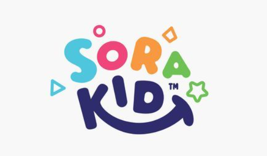
The ‘SORA KiD’ logo is a well-executed design that effectively communicates a cheerful and kid-friendly message through its consistent playful style and vibrant color palette. The harmonious integration of rounded shapes and a prominent smile makes it highly appealing and unique. However, there are minor areas for refinement, such as improving the tidiness of certain lines and curves for greater precision, and potentially simplifying some of the smaller decorative elements to enhance clarity and reduce clutter, especially at varying scales.
Positive Points
✓ The logo has a consistent playful, rounded, and hand-drawn style across all elements, which ensures all parts belong to the same visual family.
✓ The design successfully uses a happy and welcoming aesthetic, with bright colors and a prominent smile, which aligns with the principle that ‘Happy works, happy sells’ for its target audience.
✓ The overall combination of stylized lettering and the integrated smile gives the logo a unique character, avoiding common clichés and generic interpretations mentioned in the knowledge base.
Areas for Improvement
✗ While maintaining a hand-drawn feel, some lines and curves could benefit from greater precision and tidiness…
Learn more about Logo Review #3. Overall Summary