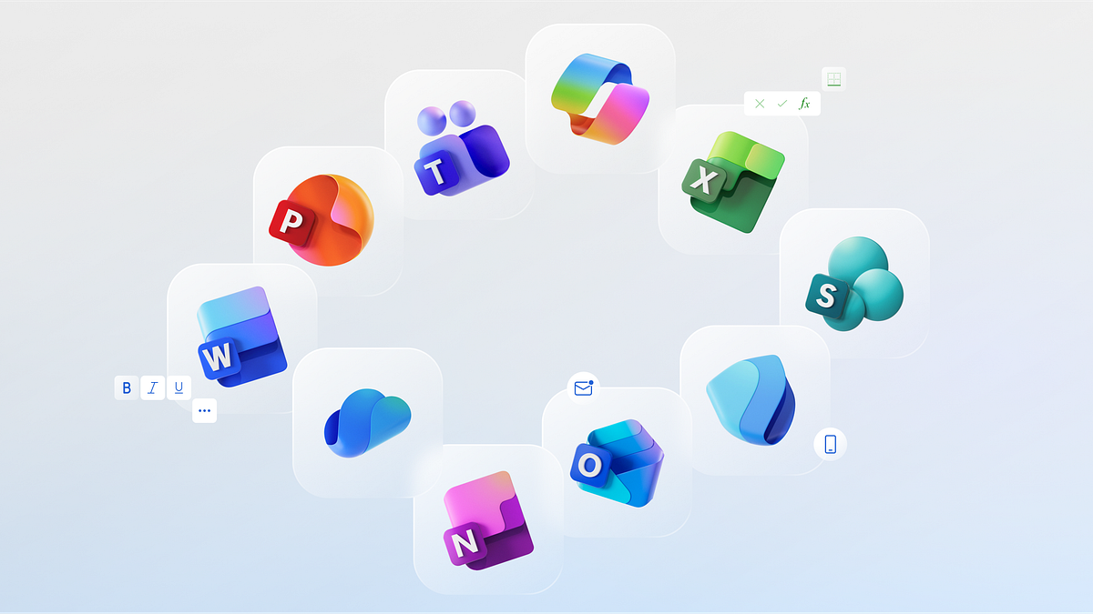

Backlash was expected when Microsoft unveiled its freshly updated icons last week — all corporate visual re-designs receive similar scrutiny. To be precise, the company transformed all 10 of its 365-suite icons. But this is no mere refresh, if you look closely you’ll see the company’s motivations, stance and plans for the future.
I waited several days before releasing my analysis, allowing me to scour the internet for people’s initial reactions and comments.
Why change?
The most common objection was born out of pure frustration with Microsoft — also aimed at the corporate world in general — and its compulsion to continually update logos and visual assets.
Some called to bring back Clippy. Others claimed the design update was triggered by Apple’s recent iOS26 upgrade, in an attempt to bring Microsoft’s icons in alignment with the visual language of iPhone’s new liquid glass.
This backlash is a natural response. We are nostalgic creatures who don’t like change. Change takes time to get used to — a point repeated in the arguments against these updates.
On one hand, there is a case for brands retaining the same look for as long as possible. One of the benefits is that it establishes a bond and a sense of stability and…
Learn more about Microsoft’s Update of 365 Icons is Not a Mere Facelift