I was engaged to create new brand identity for Parfaite Xperiences, a boutique business delivering bespoke luxury events and experiences. The branding needed to feel very luxurious to reflect the high level of experiences created and attract a discerning, exclusive clientele.
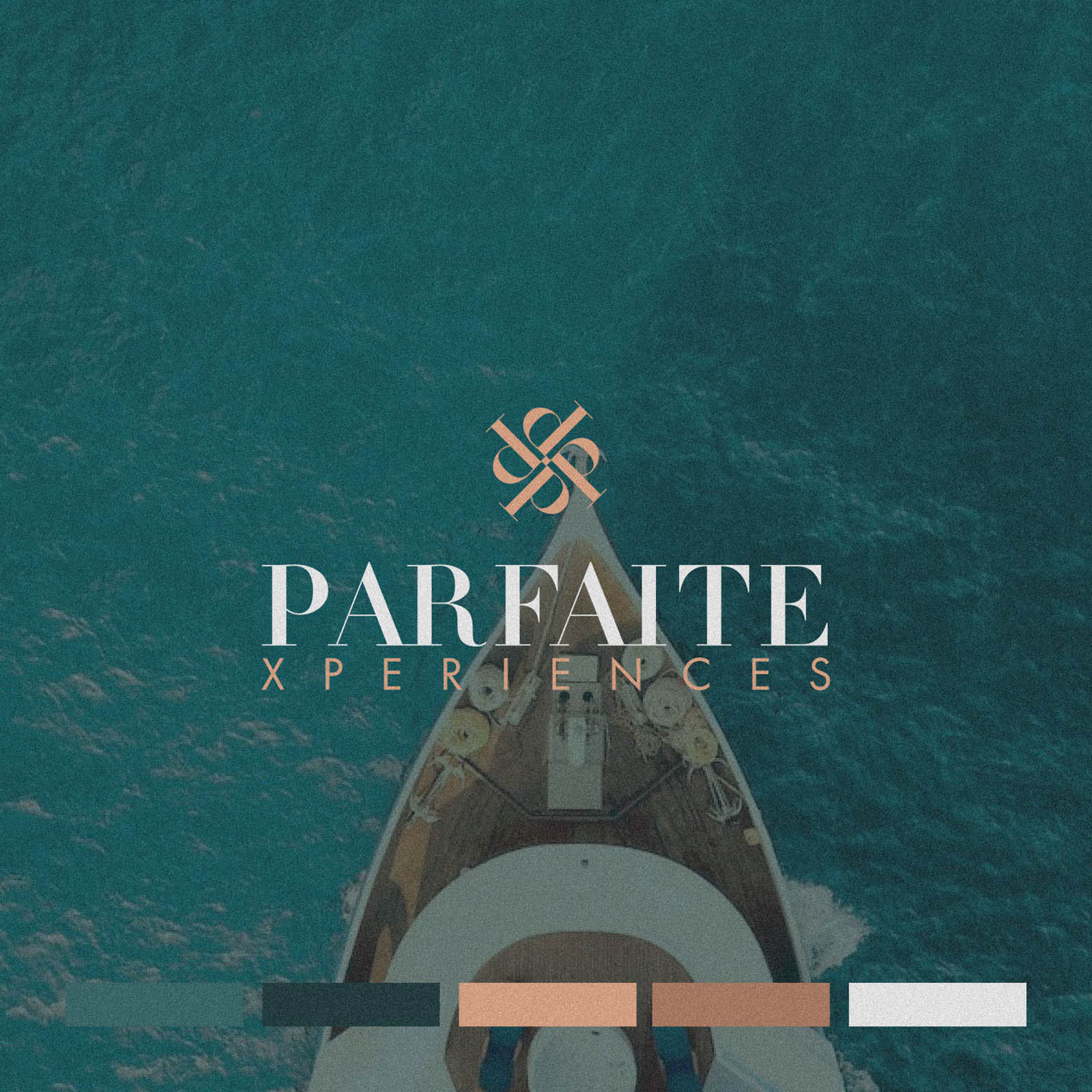
The logotype is deceptively simple, but the key is in the detail; subtle ligatures connecting certain characters, two complimentary fonts paired with just the right personally to represent the brand, and of course well balanced spacing and alignment. The brandmark takes the ‘P’ in Parfaite, and rotates it at an angle to form a simple but attractive symbol.
The colour palette truly brings the whole thing together; a rich and indulgent deep green with bluish hues, paired with muted copper tones.
I was later commissioned to create the website for Parfaite, which you can view here.

Case Study
Opportunity
In luxury events, many brands lean on predictable “sparkle” cues. Parfaite needed a visual identity that felt truly bespoke and invitation-only—reflecting a concierge approach to crafting high-end experiences for a discerning clientele.
Objectives
-
Convey opulence and exclusivity at a glance without resorting to clichés.
-
Create a refined wordmark with artisan detailing and a compact symbol for small-scale uses.
-
Establish a colour world that reads indulgent and premium across print and digital.
-
Build a simple system that holds together on proposals, itineraries, stationery and web.
Insight & Strategy
Affluent clients interpret restraint as quality. We centred the identity on quiet opulence: meticulous typographic detailing, generous spacing, and a palette that suggests richness through tone rather than ornament. A compact brandmark adds memorability in places where the full wordmark isn’t practical.
Identity Solution
-
Logotype: A deceptively simple wordmark with subtle ligatures and two complementary type styles tuned for balance and poise—engineered to read elegantly from large signage to small print.
-
Brandmark: A rotated ‘P’ forms a minimal, recognisable symbol for seals, social avatars and micro contexts while echoing the logotype’s geometry.
-
Palette: A deep green with blue undertones paired with muted copper accents—luxurious, mature, and production-friendly across foil, metallic ink and digital.
-
System & Applications: Clear lockups, spacing and minimum sizes; application guidance for invitations, programs, proposals and digital assets so the identity stays consistent in day-to-day use.
Competitive Edge Now
The brand presents composed, modern luxury—distinct from glitter-heavy category norms. The typographic craft, restrained symbol and rich palette raise perceived value while keeping communications calm and legible.
What This Enables
Ideally positioned to attract high-net-worth clients and premium partners; to present proposals with editorial polish; and to extend seamlessly into digital touchpoints—preserving the invitation-only aura as the offering evolves.


