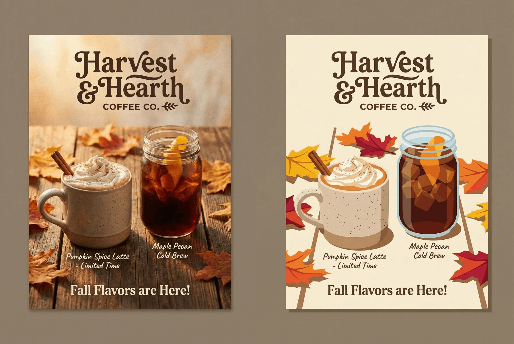

Made the same fall coffee thing in two completely different styles and honestly can't decide which one works better.
Left side is all warm and cozy, like actual photography with soft lighting and textures. Right side went full flat vector with bright colors and clean shapes.
Same drinks, same text, totally different feel though.
What do you guys think? Which one would make you want coffee more lol