Tips for Color & Contrast:
- We can use color and visual weight to emphasize or de-emphasize typography. By using lighter text for supporting or less important blocks of text it draws more attention to the bolder, more vibrant text.
- Do not rely on color alone to convey information. For example, an error state shouldn’t only be displayed with a red outline, use a warning icon and descriptive text well to alert that an issue has occurred.
- There must be a color contrast ratio of at least 4.5:1 between all text and background.
- Text resize (1.4.4): Text must be able to be resized up to 200% without negatively affecting the ability to read content or use functions.
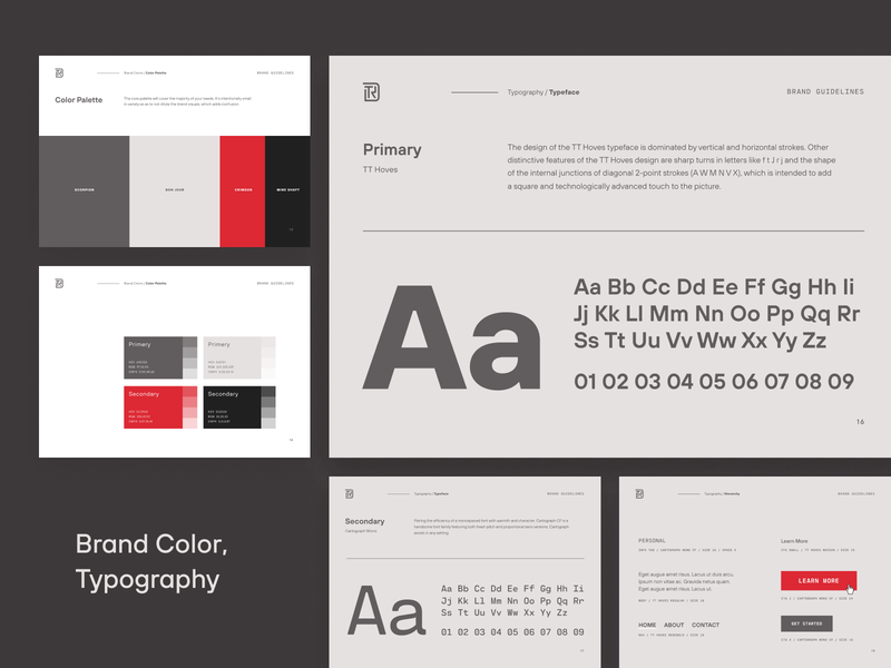
- Images of text (1.4.5): Do not use images of text unless necessary (e.g., logo).
- Provide two options for placing text on a light and a dark background
HIERARCHY
Text hierarchy is used in design because it allows the reader to digest the importance of the information. Users will have focal points and an order in which to notice and process things.
Establishing size hierarchies gives clarity to the content. The larger the size, the more recognizable it will be from the rest.
There are some key reading patterns based on Hierarchy, that is F Pattern, Z Pattern, and Guttenberg Diagram

The Gutenberg diagram describes a general pattern the eyes move through when looking at evenly distributed. The pattern suggests that the eye will sweep across and down the page in a series of horizontal movements called axes of orientation. Each sweep starts a little further from the left edge and moves a little closer to the right edge.
Z pattern implies that users will navigate the page using something by scanning the upper part of the content area forming a horizontal line. Then, down and to the left side of the visible content creating an imaginary diagonal line. Lastly, they will go back across the right forming a second horizontal line.
F pattern implies that users will navigate the page using something which by glazing the upper part of the content area then, down they move down the page and read across the shorter horizontal line for any elements that stand out. Lastly, users will scan the content’s left side in a vertical movement and look for keywords that might catch their eye.
The Law of Hierarchy